Ôvoyages
Expertise
UI design
Design system creation
UX contribution
Delivrable
High-fidelity UI mockups
Custom UI kit
Style guidelines
The project
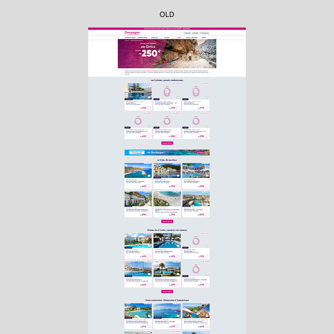
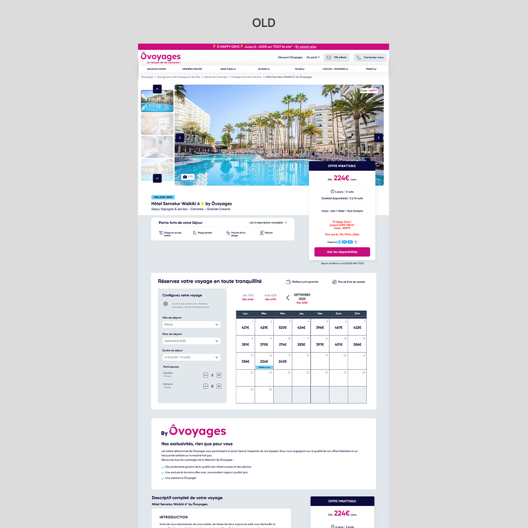
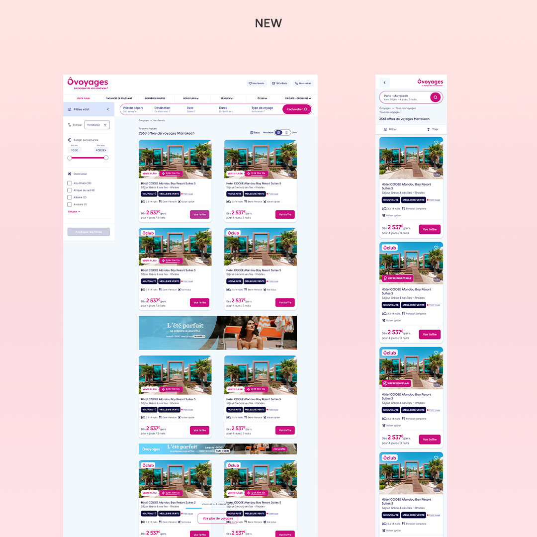
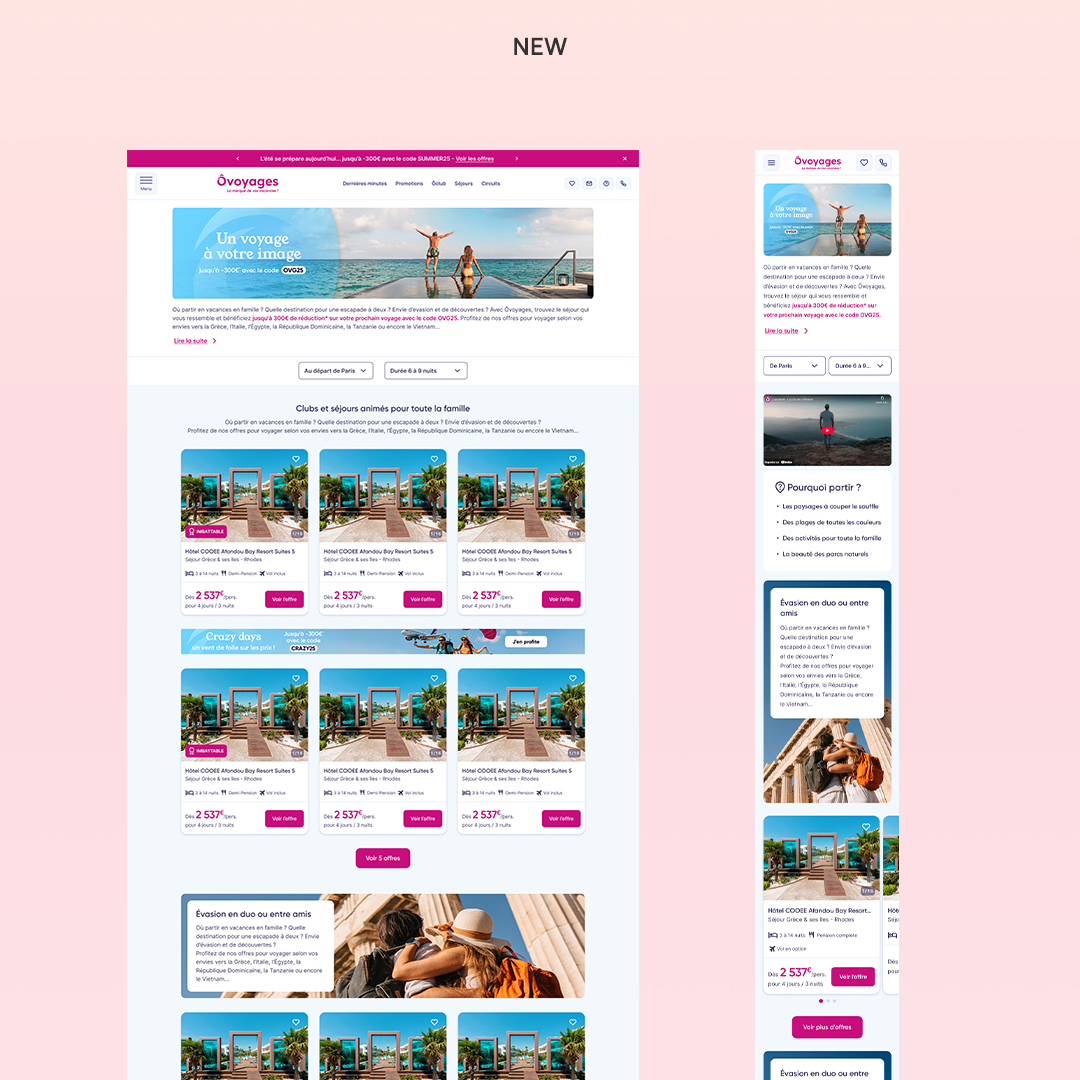
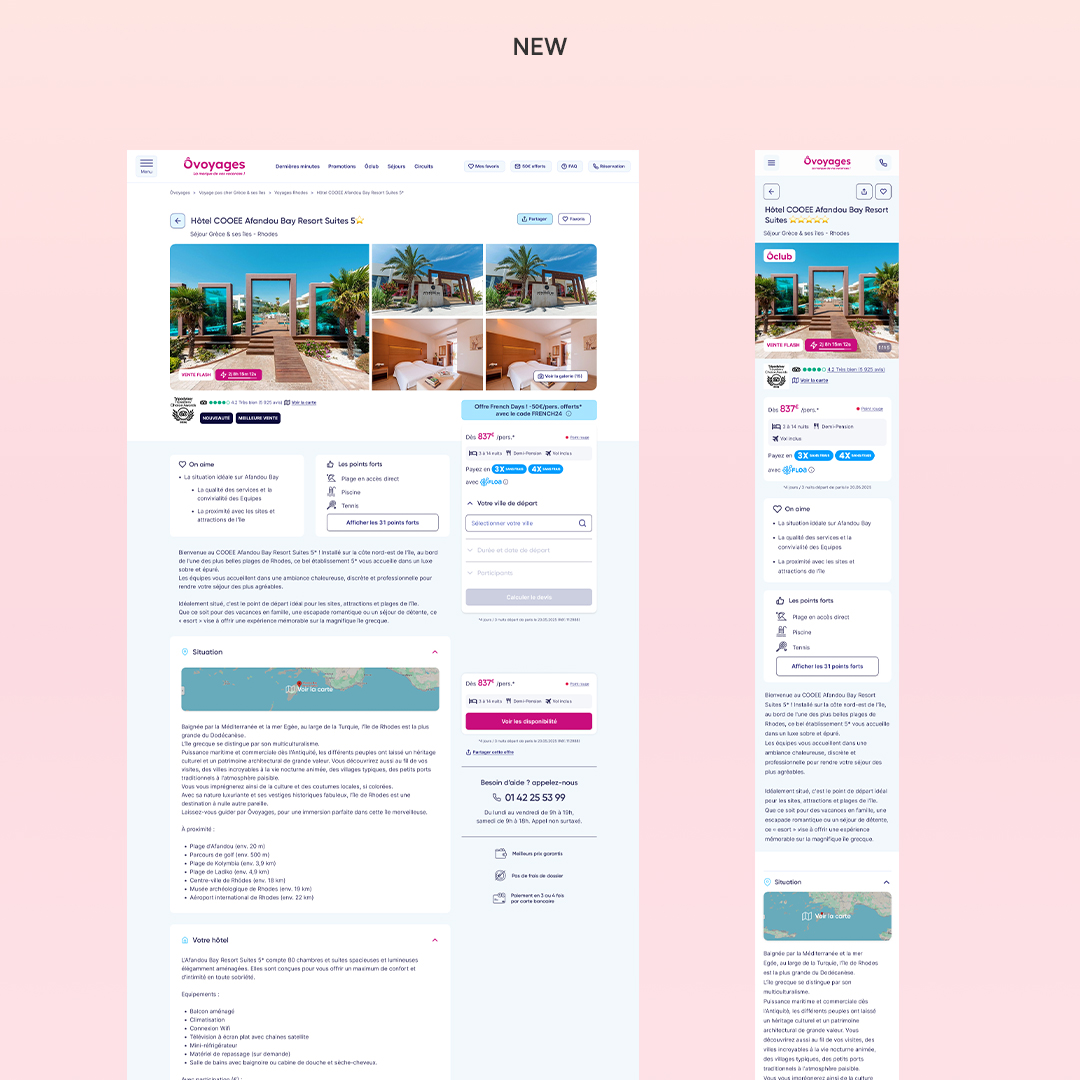
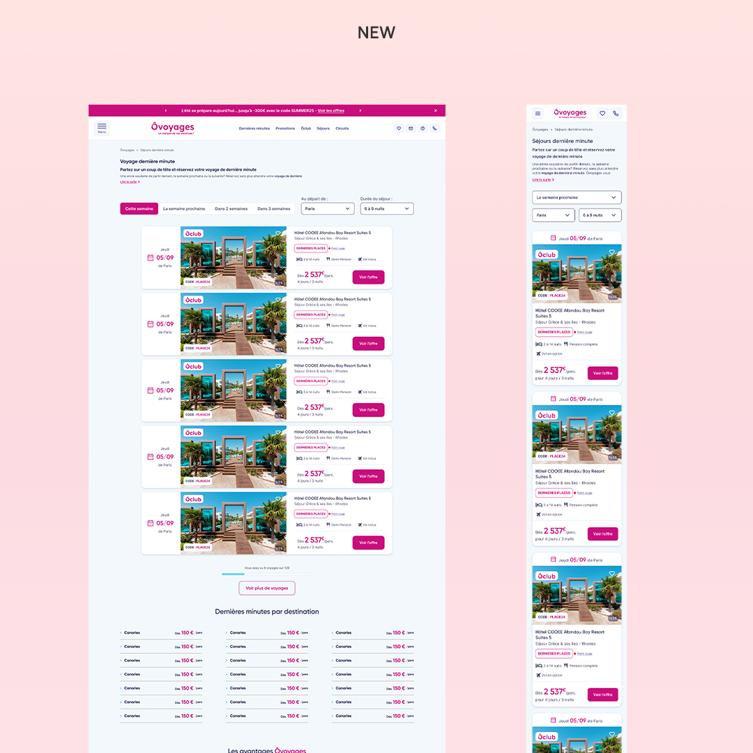
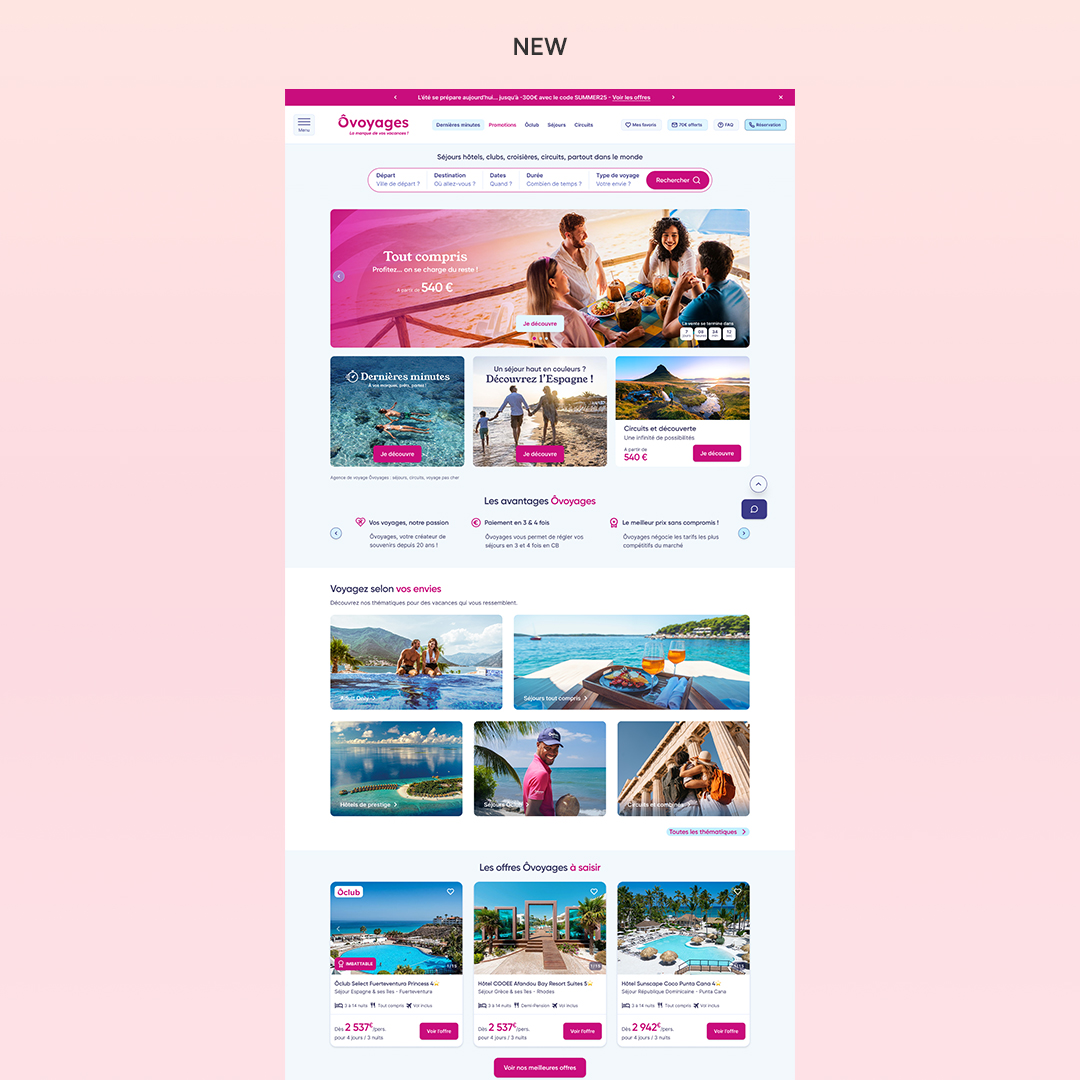
I worked on the redesign of ovoyages.com with a focus on UI, helping create a visually consistent and user-friendly platform across key pages like the homepage, product pages, and the search engine.
I was in charge of designing the new interface, creating a UI kit from scratch, and ensuring consistency across all screens. I also contributed to improving user flows and layout clarity to support better navigation and conversion.
Design process
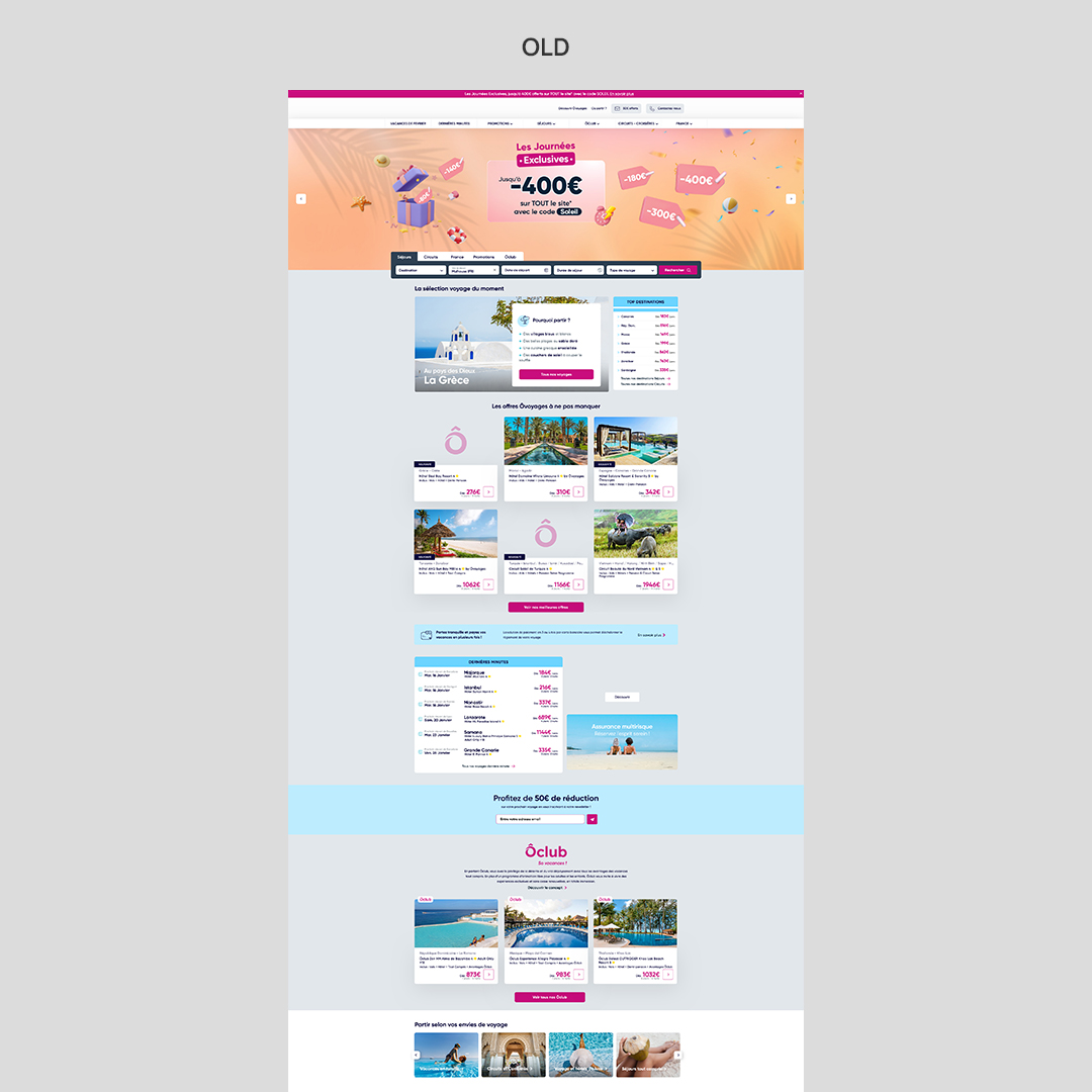
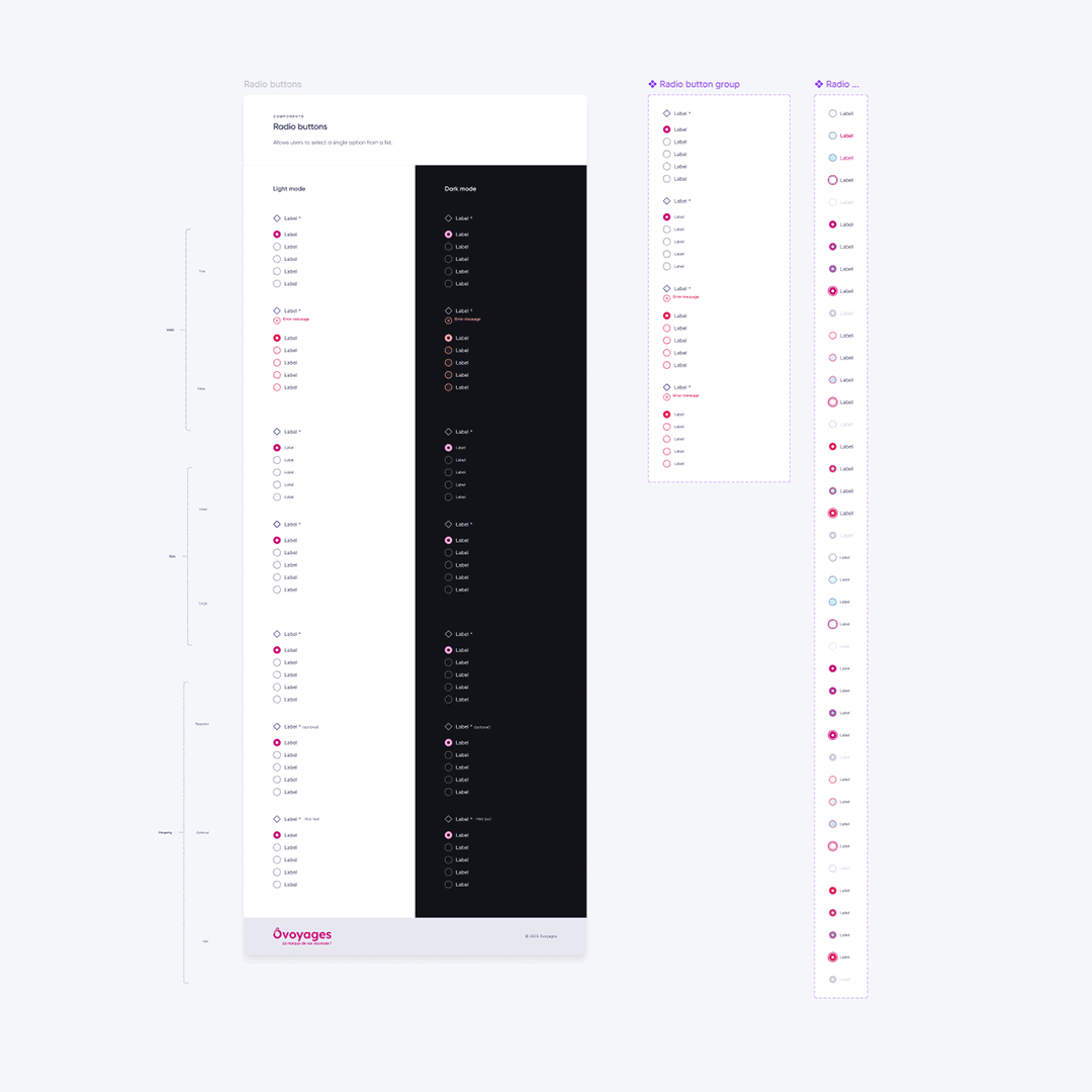
The project started with a general brief and team meetings to define priorities. The main goal: build a responsive, simplified site that helps users find their ideal trip quickly. I created a complete UI kit, as no component library existed. One of my key tasks was to streamline the brand’s very colorful identity and bring clarity and visual hierarchy across pages. I worked closely with the marketing director, acquisition lead, project manager, and developers. With no dedicated design team, I also had to advocate for design consistency and defend user-centered decisions.
A major challenge came from the Orchestra backend system, which limited flexibility in how travel data (especially hotel descriptions) could be displayed. I collaborated directly with their team to better understand and work around these constraints.
Post-launch
Although no user testing was conducted, I recommended implementing it. The team set up Clarity and Google Analytics to monitor usage and guide future iterations. This project was a great challenge that allowed me to grow in complexity management, communication with cross-functional teams, and UI system building under technical constraints.